
Are you looking to revamp your home’s interior but feel overwhelmed by the endless possibilities of interior color combinations? This article presents 10 stunning color palettes guaranteed to transform your space. Whether you crave a serene and calming atmosphere or a vibrant and energetic ambiance, we’ve curated a selection of color schemes that will inspire you to create a truly personalized and beautiful living environment. Discover the power of color psychology and learn how to choose the perfect interior paint colors to reflect your unique style and enhance your overall well-being. Prepare to be inspired by our expertly selected color combinations for interior design.
Classic Black and White
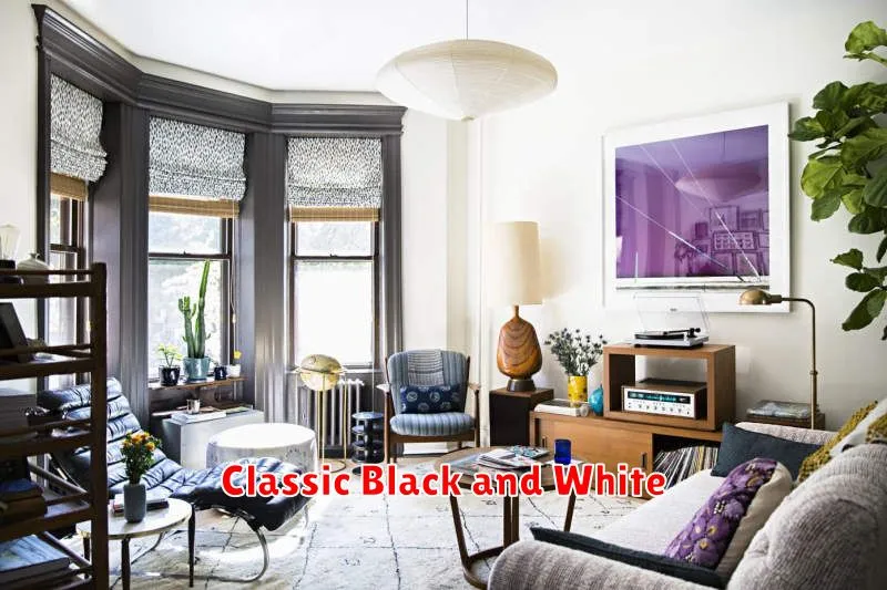
The classic black and white color combination offers unparalleled versatility and sophistication. Its timeless appeal stems from its inherent contrast, capable of creating both dramatic and serene atmospheres depending on the application. This duality makes it a perfect choice for a wide range of interior design styles, from minimalist modern to elegantly traditional.
Black provides depth and visual weight, grounding the space and adding a sense of luxury. Used strategically, it can highlight architectural features or create a focal point. Conversely, white brightens the room, expands the perceived space, and enhances the feeling of airiness and cleanliness. The interplay between these two colors allows for endless possibilities in terms of texture and visual interest.
To achieve a successful black and white interior, consider the balance between the two colors. A predominantly white space with black accents can feel open and airy, while a more balanced approach, incorporating substantial areas of black, creates a bolder, more dramatic effect. The incorporation of varying textures—such as smooth marble against rough linen—further enhances the visual richness of this timeless palette.
Soft Blues and Greys
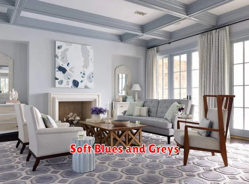
The combination of soft blues and greys creates a serene and sophisticated atmosphere. Light blues, such as powder blue or sky blue, paired with various shades of grey, from light dove grey to charcoal, offer a calming effect, perfect for bedrooms or living rooms. The versatility of this palette allows for both modern and traditional design aesthetics.
Consider incorporating textures to add depth and interest to this color scheme. Soft furnishings like plush velvet in grey, or linen in a pale blue, can complement the cool tones. Metallic accents, such as silver or brushed nickel, can also elevate the space, adding a touch of glamour without disrupting the overall calming effect.
This palette’s flexibility extends to various lighting conditions. In spaces with ample natural light, the blues and greys will appear vibrant and airy. In rooms with less natural light, warmer grey tones can be employed to avoid a cold feel, creating a cozy and inviting ambiance. Strategic placement of lighting further enhances the overall effect, showcasing the subtle nuances of the colors.
Earthy Browns and Greens
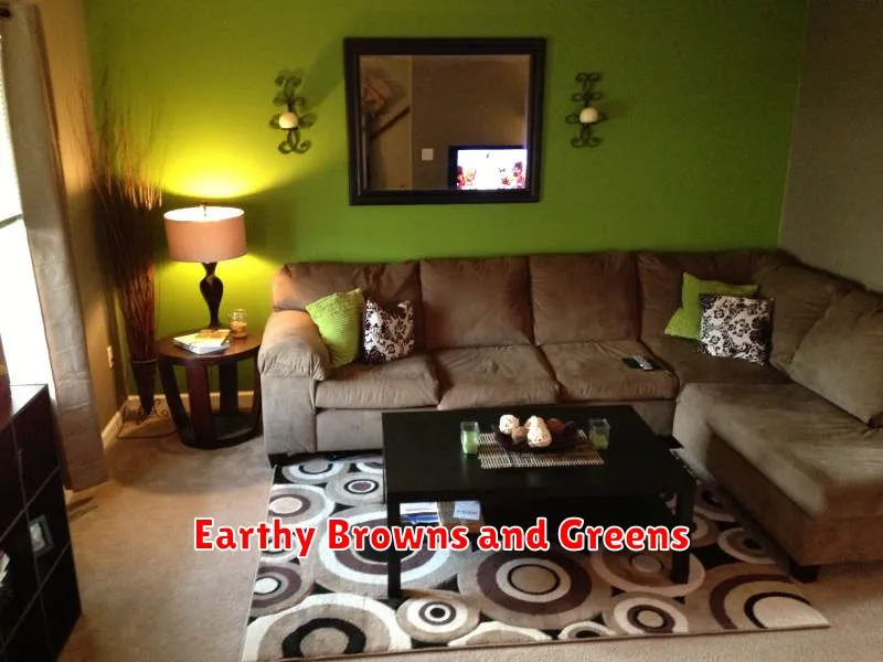
The combination of earthy browns and greens creates a naturally calming and sophisticated atmosphere. Brown, in its various shades from warm terracotta to cool taupe, provides a grounding base, while greens, ranging from sage to olive, introduce vibrancy and freshness. This palette evokes a sense of connection with nature, making it ideal for spaces where relaxation and tranquility are desired.
Consider using a deeper brown as an accent wall, pairing it with lighter green tones on the remaining walls. Incorporating natural textures like wood, rattan, or linen further enhances the earthy feel. Introduce pops of color with cream or beige accessories for a balanced and harmonious look.
This color scheme is incredibly versatile and works well in various rooms. A living room decorated with earthy browns and greens will feel inviting and cozy, while a bedroom will benefit from its restful quality. Even a kitchen can successfully utilize this palette with careful selection of cabinetry and countertops. The key is to balance the warmth of the browns with the coolness of the greens for a perfectly balanced and visually appealing result.
Pastel Pinks and Whites

The combination of pastel pinks and whites creates a serene and sophisticated atmosphere. Pastel pinks, ranging from blush to rose, offer a soft, romantic touch, while white provides a clean, airy backdrop. This pairing is incredibly versatile, working well in bedrooms, living rooms, and even bathrooms.
To achieve a balanced look, consider using a deeper shade of pink as an accent color on furniture or accessories. A white base, whether on walls, floors, or larger pieces of furniture, keeps the space feeling bright and open. Incorporating natural materials like wood and linen complements this color scheme beautifully, adding warmth and texture.
This palette is easily customized to suit different preferences. For a more modern feel, opt for crisp white and a cool-toned pastel pink. For a more traditional aesthetic, incorporate warmer pink tones and ornate details. The flexibility of pastel pinks and whites allows for considerable creative freedom in interior design.
Bold Red and Gold Accents
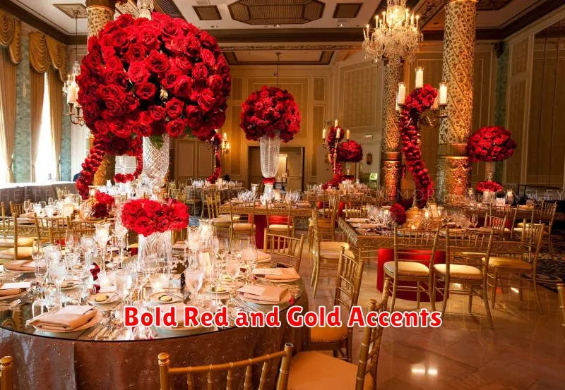
The combination of bold red and rich gold creates a luxurious and dramatic effect in interior design. This pairing offers a sophisticated contrast, with the vibrancy of red energized by the warmth and opulence of gold. Consider using red as an accent wall, incorporating gold through metallic furnishings or decorative elements such as picture frames or throw pillows.
To avoid overwhelming the space, balance the intensity of the red and gold with neutral tones. Off-white, cream, or beige walls provide a calming backdrop, allowing the red and gold to shine as statement pieces. Subtle textures, such as velvet upholstery in red or a gold-toned rug, add depth and complexity to the design.
This color scheme works exceptionally well in living rooms, dining rooms, or even bedrooms to create a sense of refined elegance and warm sophistication. Remember to use the colors strategically; a little goes a long way to achieving a visually stunning and memorable impact.
Neutral Beige with Vibrant Pops
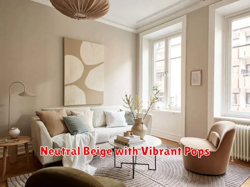
A neutral beige base provides a calming and versatile backdrop for any room. Its understated elegance allows bolder colors to truly shine. Consider using beige on walls and larger furniture pieces to create a sense of spaciousness and tranquility.
Introduce vibrant pops of color strategically through accessories such as throw pillows, blankets, artwork, or even a statement rug. Jewel tones like emerald green, sapphire blue, or ruby red create a luxurious feel, while brighter shades like sunny yellow or coral offer a more playful and energetic vibe. The key is to choose colors that complement each other and reflect your personal style.
The beauty of this combination lies in its adaptability. Whether you prefer a sophisticated, minimalist aesthetic or a more eclectic and bold look, the neutral beige foundation ensures a harmonious balance, allowing you to easily adjust the intensity and variety of your accent colors to achieve your desired atmosphere.
Rich Navy and Mustard Yellow
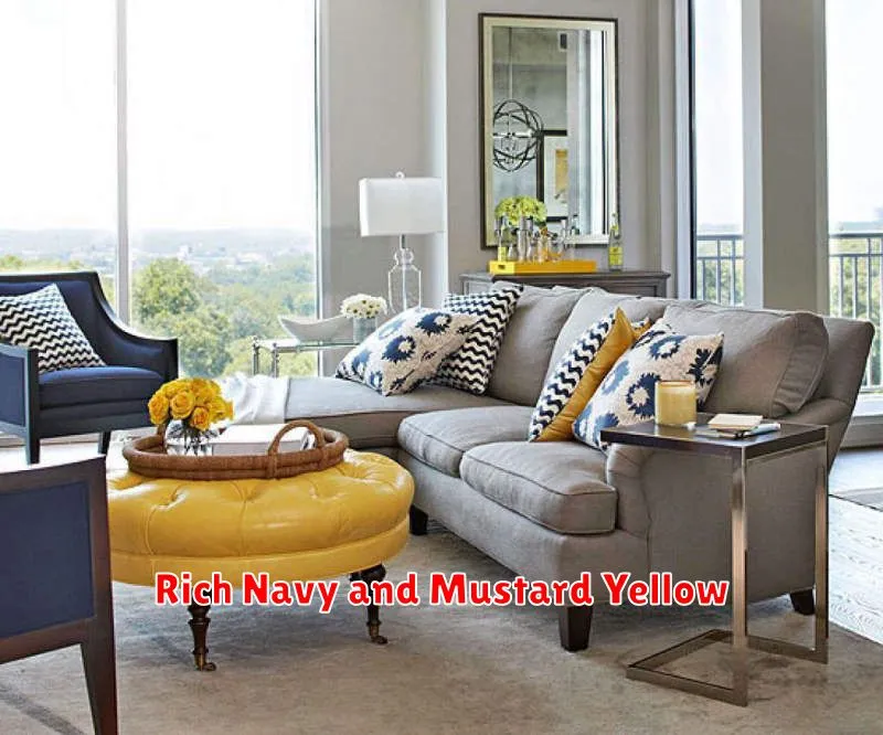
The combination of rich navy and mustard yellow creates a sophisticated and vibrant atmosphere. Navy, a deep and grounding color, provides a sense of stability and luxury. Mustard yellow, a warm and sunny hue, injects energy and a touch of unexpected whimsy. This pairing works beautifully in both traditional and modern settings.
Consider using navy as your base color for walls or larger furniture pieces, allowing the mustard yellow to act as an accent. Mustard yellow throw pillows, artwork, or even smaller furniture pieces can effectively punctuate the navy backdrop. The contrast between the deep blue and the bright yellow generates a visually stimulating effect, preventing the space from feeling monotonous.
To avoid overwhelming the space, maintain a balance between the two colors. Incorporate neutral elements like white or beige to soften the intensity and create a cohesive design. This combination is particularly effective in living rooms, dining rooms, and even bedrooms, offering a unique and stylish ambiance that’s both calming and invigorating.
Elegant Cream and Teal
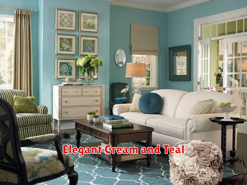
The combination of cream and teal creates a sophisticated and calming atmosphere. Cream, a warm neutral, provides a tranquil backdrop, while teal, a vibrant blue-green, adds a touch of unexpected color and visual interest. This pairing works well in various rooms, offering a sense of serenity and elegance.
Consider using cream as your base color on walls and larger furniture pieces. Introduce teal through accent furniture, such as an armchair or ottoman, throw pillows, or artwork. This strategic placement of teal prevents the space from feeling overwhelming, while still allowing the color to shine.
To enhance the elegance, incorporate gold or brass accents. These metallic finishes complement both cream and teal beautifully, adding a touch of luxury and sophistication. Think gold picture frames, brass lamps, or decorative hardware. This refined color palette is ideal for creating a space that is both stylish and relaxing.
Dark Charcoal with Warm Tones

The pairing of dark charcoal gray with warm tones creates a sophisticated and inviting atmosphere. The deep gray acts as a grounding neutral, providing a rich backdrop for accent colors. Consider incorporating warm hues such as burnt orange, terracotta, or golden yellow to balance the cool undertones of the charcoal and add a sense of warmth and vibrancy.
This color combination works exceptionally well in various rooms. In a living room, dark charcoal walls can be complemented by terracotta-colored throw pillows and a golden yellow rug. A bedroom might benefit from charcoal bedding accented with burnt orange drapes and a warm-toned wooden nightstand. The key is to use the warm tones strategically, preventing the space from feeling too dark or heavy.
To maintain balance, incorporate elements that reflect light. Natural materials like wood and linen, along with strategically placed lighting, will help to brighten the space and prevent the charcoal from overwhelming the room. This combination offers a sense of drama and elegance, providing a striking yet cozy interior design.
Subtle Lilac and Silver
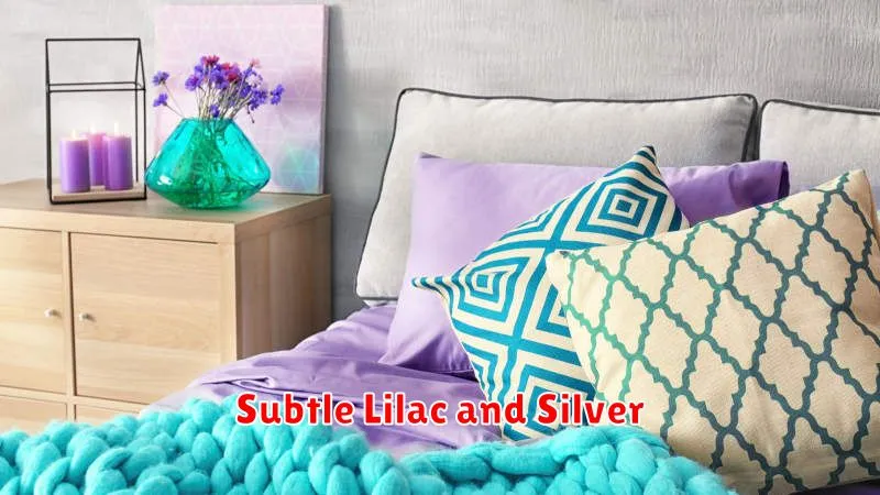
A subtle lilac and silver palette offers a sophisticated and calming atmosphere. The soft, muted lilac provides a sense of tranquility, while the silver adds a touch of elegance and modernity. This combination works well in bedrooms, living rooms, or even bathrooms, creating a space that feels both luxurious and peaceful.
Consider using various shades of lilac, from pale lavender to a deeper, richer purple, to add depth and visual interest. Incorporate silver through metallic accents such as light fixtures, picture frames, or decorative elements. A silver-grey rug or subtly patterned wallpaper with a silver thread can also enhance the overall aesthetic. The key is to maintain a balance, preventing either color from overpowering the other.
This pairing is incredibly versatile and can be adjusted to suit different interior styles. A minimalist approach would utilize a simple lilac wall and silver furniture, while a more ornate style might incorporate intricate silver detailing against a lilac backdrop. The adaptability of subtle lilac and silver makes it a truly transformative color combination.